UI Extensions
Argo CD web user interface can be extended with additional UI elements. Extensions should be delivered as a javascript file
in the argocd-server Pods that are placed in the /tmp/extensions directory and starts with extension prefix ( matches to ^extension(.*)\.js$ regex ).
/tmp/extensions
├── example1
│   └── extension-1.js
└── example2
    └── extension-2.js
Extensions are loaded during initial page rendering and should register themselves using API exposed in the extensionsAPI global variable. (See
corresponding extension type details for additional information).
The extension should provide a React component that is responsible for rendering the UI element. Extension should not bundle the React library.
Instead extension should use the react global variable. You can leverage externals setting if you are using webpack:
externals: {
  react: "React";
}
Resource Tab Extensions
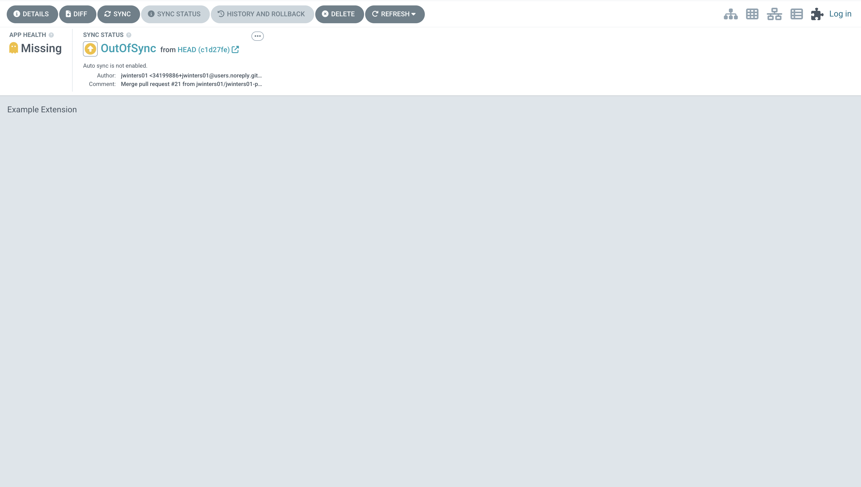
Resource Tab extensions is an extension that provides an additional tab for the resource sliding panel at the Argo CD Application details page.
The resource tab extension should be registered using the extensionsAPI.registerResourceExtension method:
registerResourceExtension(component: ExtensionComponent, group: string, kind: string, tabTitle: string)
-
component: ExtensionComponentis a React component that receives the following properties: -
application: Application - Argo CD Application resource;
- resource: State - the Kubernetes resource object;
- tree: ApplicationTree - includes list of all resources that comprise the application;
See properties interfaces in models.ts
group: string- the glob expression that matches the group of the resource; note: use globstar (**) to match all groups including empty string;kind: string- the glob expression that matches the kind of the resource;tabTitle: string- the extension tab title.opts: Object- additional options:icon: string- the class name the represents the icon from the https://fontawesome.com/ library (e.g. 'fa-calendar-alt');
Below is an example of a resource tab extension:
((window) => {
  const component = () => {
    return React.createElement("div", {}, "Hello World");
  };
  window.extensionsAPI.registerResourceExtension(
    component,
    "*",
    "*",
    "Nice extension"
  );
})(window);
System Level Extensions
Argo CD allows you to add new items to the sidebar that will be displayed as a new page with a custom component when clicked. The system level extension should be registered using the extensionsAPI.registerSystemLevelExtension method:
registerSystemLevelExtension(component: ExtensionComponent, title: string, options: {icon?: string})
Below is an example of a simple system level extension:
((window) => {
  const component = () => {
    return React.createElement(
      "div",
      { style: { padding: "10px" } },
      "Hello World"
    );
  };
  window.extensionsAPI.registerSystemLevelExtension(
    component,
    "Test Ext",
    "/hello",
    "fa-flask"
  );
})(window);
Application Tab Extensions
Since the Argo CD Application is a Kubernetes resource, application tabs can be the same as any other resource tab. Make sure to use 'argoproj.io'/'Application' as group/kind and an extension will be used to render the application-level tab.
Application Status Panel Extensions
The status panel is the bar at the top of the application view where the sync status is displayed. Argo CD allows you to add new items to the status panel of an application. The extension should be registered using the extensionsAPI.registerStatusPanelExtension method:
registerStatusPanelExtension(component: StatusPanelExtensionComponent, title: string, id: string, flyout?: ExtensionComponent)
Below is an example of a simple extension:
((window) => {
  const component = () => {
    return React.createElement(
      "div",
      { style: { padding: "10px" } },
      "Hello World"
    );
  };
  window.extensionsAPI.registerStatusPanelExtension(
    component,
    "My Extension",
    "my_extension"
  );
})(window);
Flyout widget
It is also possible to add an optional flyout widget to your extension. It can be opened by calling openFlyout() from your extension's component. Your flyout component will then be rendered in a sliding panel, similar to the panel that opens when clicking on History and rollback.
Below is an example of an extension using the flyout widget:
((window) => {
  const component = (props: { openFlyout: () => any }) => {
    return React.createElement(
      "div",
      {
        style: { padding: "10px" },
        onClick: () => props.openFlyout(),
      },
      "Hello World"
    );
  };
  const flyout = () => {
    return React.createElement(
      "div",
      { style: { padding: "10px" } },
      "This is a flyout"
    );
  };
  window.extensionsAPI.registerStatusPanelExtension(
    component,
    "My Extension",
    "my_extension",
    flyout
  );
})(window);
Top Bar Action Menu Extensions
The top bar panel is the action menu at the top of the application view where the action buttons are displayed like Details, Sync, Refresh. Argo CD allows you to add new button to the top bar action menu of an application. When the extension button is clicked, the custom widget will be rendered in a flyout panel.
The extension should be registered using the extensionsAPI.registerTopBarActionMenuExt method:
registerTopBarActionMenuExt(
  component: TopBarActionMenuExtComponent,
  title: string,
  id: string,
  flyout?: ExtensionComponent,
  shouldDisplay: (app?: Application) => boolean = () => true,
  iconClassName?: string,
  isMiddle = false
)
The callback function shouldDisplay should return true if the extension should be displayed and false otherwise:
const shouldDisplay = (app: Application) => {
  return (
    application.metadata?.labels?.["application.environmentLabelKey"] === "prd"
  );
};
Below is an example of a simple extension with a flyout widget:
((window) => {
  const shouldDisplay = () => {
    return true;
  };
  const flyout = () => {
    return React.createElement(
      "div",
      { style: { padding: "10px" } },
      "This is a flyout"
    );
  };
  const component = () => {
    return React.createElement(
      "div",
      {
        onClick: () => flyout(),
      },
      "Toolbar Extension Test"
    );
  };
  window.extensionsAPI.registerTopBarActionMenuExt(
    component,
    "Toolbar Extension Test",
    "Toolbar_Extension_Test",
    flyout,
    shouldDisplay,
    "",
    true
  );
})(window);
App View Extensions
App View extensions allow you to create a new Application Details View for an application. This view would be selectable alongside the other views like the Node Tree, Pod, and Network views. When the extension's icon is clicked, the extension's component is rendered as the main content of the application view.
Register this extension through the extensionsAPI.registerAppViewExtension method.
registerAppViewExtension(
  component: ExtensionComponent,  // the component to be rendered
  title: string,                  // the title of the page once the component is rendered
  icon: string,                   // the favicon classname for the icon tab
  shouldDisplay?: (app: Application): boolean // returns true if the view should be available
)
Below is an example of a simple extension:
((window) => {
  const component = () => {
    return React.createElement(
      "div",
      { style: { padding: "10px" } },
      "Hello World"
    );
  };
  window.extensionsAPI.registerAppViewExtension(
    component,
    "My Extension",
    "fa-question-circle",
    (app) =>
      application.metadata?.labels?.["application.environmentLabelKey"] ===
      "prd"
  );
})(window);
Example rendered extension: